Introduction
bartisan fits Bayesian additive regression trees (BART)
using the same interface as glm(). You supply a formula, a
data frame, and a family, and the model estimates the relationship
between the predictors and the outcome without you having to say what
shape that relationship takes. Nonlinearity and interactions are found
rather than specified.
This vignette walks through a complete analysis: fitting a model, checking that it worked, seeing which predictors it uses, reading off the effects, predicting for new observations, and comparing models. It assumes you are comfortable with regression but does not assume familiarity with machine learning or Bayesian methods.
The main thing to take from it is that the defaults are meant to be used. The priors, the number of trees, and the sampler settings are chosen to work across a wide range of problems, and tuning them is rarely where the gains are. Almost everything below is a single function call with no arguments beyond the formula and the data.
Each section ends with a pointer to a vignette that covers the same ground in more depth.
The data
rhc records 1500 critically ill patients from the
SUPPORT study and whether each received right heart catheterization, a
monitoring procedure, within a day of arriving in intensive care (Connors et al.
1996). The question the study asked is whether the procedure
helps or harms.
data(rhc)

str(rhc)
#> 'data.frame':    1500 obs. of  16 variables:
#>  $ rhc   : int  0 0 0 0 0 1 0 0 0 1 ...
#>  $ death : int  1 0 0 1 0 0 1 1 0 1 ...
#>  $ days  : int  37 235 189 13 202 203 663 15 239 22 ...
#>  $ age   : num  75.3 55 34.4 42.2 41.4 ...
#>  $ sex   : Factor w/ 2 levels "female","male": 1 2 2 1 2 2 2 2 2 2 ...
#>  $ race  : Factor w/ 3 levels "white","black",..: 1 1 1 1 2 1 1 1 1 1 ...
#>  $ edu   : num  9 14 15 16 11 ...
#>  $ aps   : int  48 29 21 55 60 68 26 89 59 105 ...
#>  $ meanbp: num  55 67 66 77 53 47 63 44 50 33 ...
#>  $ resp  : num  26 10 30 40 12 40 22 0 33 44 ...
#>  $ hema  : num  26.3 29 23.8 53 31 ...
#>  $ pafi  : num  157 149 202 171 390 ...
#>  $ paco2 : num  30 45 37 25 31 28 40 39 36 31 ...
#>  $ crea  : num  1.7 1 0.5 1.9 15 ...
#>  $ surv2m: num  0.441 0.339 0.846 0.672 0.777 ...
#>  $ card  : Factor w/ 2 levels "no","yes": 1 1 1 1 1 1 2 2 1 1 ...
The outcome comes in two forms. death is whether the
patient died during follow-up, and days is how long that
took. This vignette uses the binary form;
vignette("survival") uses the other.
The remaining variables are the patient’s age, sex, race and years of
education, seven physiological measurements taken on the first day,
whether cardiovascular disease was among the diagnoses, and
surv2m, the study’s own estimate of the patient’s chance of
surviving two months. All were recorded before catheterization.
Fitting the model
set.seed(2026)

# For parallelization; optional
if (rlang::is_installed("future")) {
  future::plan(future::multisession)
}

fit <- bartisan(
  death ~ rhc + age + sex + race + edu + aps + meanbp + resp + hema +
    pafi + paco2 + crea + surv2m + card,
  data = rhc, family = binomial(), chains = 4
)

fit
#> Generalized BART
#>
#> Call:
#> bartisan(formula = death ~ rhc + age + sex + race + edu + aps +
#>     meanbp + resp + hema + pafi + paco2 + crea + surv2m + card,
#>     data = rhc, family = binomial(), chains = 4)
#>
#> Family: "binomial" with the "logit" link
#> Observations: 1500
#> Structure: 1 forest of 50 trees, soft decision rules
#> Draws: 3200 kept across 4 chains after 200 warmup
That is the whole call. family = binomial() says the
outcome is binary, exactly as in glm(). The family may be
omitted, in which case it is read off the outcome and reported; naming
it is clearer and silences the message.
chains = 4 runs the sampler four times from different
starting points. The default is one chain, which is enough to get
estimates, but running several is what makes the convergence diagnostics
in the next section available.
Choosing a family is the one modeling decision that usually matters
more than any sampler setting. vignette("families") covers
the choice, and vignette("survival") covers censored
outcomes such as this one’s days.
Checking the model
Two questions are worth separating: whether the sampler converged, and whether the model fits.
Convergence
diagnose() computes the convergence and mixing
statistics, applies the conventional thresholds, and says what to change
about whichever of them fall short.
diagnose(fit)
#> Convergence and mixing
#>
#>                             quantity  rhat rhat_late ess_bulk ess_tail
#>                               loglik 1.125     1.036       23      234
#>                           splits.eta 1.014     1.039      264      731
#>  eta.eta (average over observations) 1.004     0.999     1610     2278
#>   eta.eta (worst 5% of observations) 1.045     1.073       80      305
#>
#> ✔ 4 chains, 3200 draws kept in total
#> ✖ R-hat is above 1.01 for loglik
#> ✖ That R-hat rests on only 23 effective draws, where 4 chains average 1.171
#>   even when they agree
#> ℹ A longer warmup is not the fix: R-hat stays high on the second half of the
#>   draws alone as well
#> ✖ The chains disagree about how many splitting rules the forest has (R-hat
#>   1.01)
#> ✖ Bulk ESS is 23 for loglik, below 400
#> ✖ Tail ESS is 234 for loglik, below 400
#> ℹ The chains disagree about individual observations and agree about their
#>   average (R-hat 1.00, 1610 effective draws)
#> ℹ Per-draw efficiency is lowest for loglik, which carries 0.7 effective draws
#>   per hundred kept
#>
#> What to do
#>
#> • Raise `num_draws`, which was `800`. R-hat is above the threshold for a
#>   quantity that carries too few effective draws for the threshold to mean
#>   anything: with this many chains it would sit about where it does even if the
#>   chains agreed exactly, as the check above reports. Effective sample size is
#>   what makes it readable, and that grows with the total number of draws; using
#>   fewer chains lowers the bar as well, since R-hat's null rises with the number
#>   of chains being compared.
#> • If that does not settle it, reduce `num_trees`. A smaller forest has fewer
#>   ways to represent the same fit, so the sampler has less room to move between
#>   them.
#> • Then check the family. A likelihood that fits the data badly can give a
#>   posterior with no single place to be; `bayesplot::pp_check()` is the
#>   diagnostic.
#> • Note that the chains disagree about the fitted values of individual
#>   observations and not about their average, which is the usual shape of this in
#>   a forest. What that means for an estimand cannot be read off this table
#>   either way, since an estimand is a contrast and a contrast can mix badly
#>   where the function it contrasts mixes well. Compute it: `diagnose()` takes
#>   the output of `estimate_effect()`, and `posterior::as_draws()` hands the
#>   draws to `posterior::summarise_draws()` for anything else.
rhat compares variation between chains to variation
within them; values near 1 indicate the chains have settled on the same
answer. rhat_late is the same statistic on the second half
of the draws alone, which is what distinguishes a warmup that ended too
early from chains that have each settled somewhere different.
ess_bulk and ess_tail are effective sample
sizes, and count how many independent draws the correlated ones are
worth, in the middle of the distribution and in the tails.
Read the rows that correspond to quantities you will report.
eta.eta is the fitted function and appears twice, once
averaged over the observations and once over the worst 5% of them; the
second is what governs a prediction for one observation. Forests mix
slowly on their fitted values, so a figure above 1.01 on the worst-5%
row is ordinary rather than alarming;
vignette("diagnostics") explains what to do about it and
when to worry.
No row here governs an effect, though, and the average row in
particular should not be read as if it did. An effect is a contrast, and
a contrast can mix badly where the function it is a contrast of mixes
well. diagnose() takes the estimand itself when there is
one to take:
diagnose(estimate_effect(fit, treat = "rhc"))
#> Convergence and mixing
#>
#>     quantity  rhat rhat_late ess_bulk ess_tail
#>  Y[1] - Y[0] 1.035     1.105      117       64
#>         Y[0] 1.019     1.059      190      388
#>         Y[1] 1.028     1.083      148      221
#>
#> ✔ 4 chains, 3200 draws kept in total
#> ✖ R-hat is above 1.01 for Y[1] - Y[0]
#> ✖ That R-hat rests on only 117 effective draws, where 4 chains average 1.034
#>   even when they agree
#> ℹ A longer warmup is not the fix: R-hat stays high on the second half of the
#>   draws alone as well
#> ✖ Bulk ESS is 117 for Y[1] - Y[0], below 400
#> ✖ Tail ESS is 64 for Y[1] - Y[0], below 400
#> ℹ Per-draw efficiency is lowest for Y[1] - Y[0], which carries 3.7 effective
#>   draws per hundred kept
#> ℹ 10% of draws put the contrast at exactly zero, which is the splitting prior
#>   dropping the treatment
#>
#> What to do
#>
#> • Raise `num_draws`, which was `800`. R-hat is above the threshold for a
#>   quantity that carries too few effective draws for the threshold to mean
#>   anything: with this many chains it would sit about where it does even if the
#>   chains agreed exactly, as the check above reports. Effective sample size is
#>   what makes it readable, and that grows with the total number of draws; using
#>   fewer chains lowers the bar as well, since R-hat's null rises with the number
#>   of chains being compared.
#> • If that does not settle it, reduce `num_trees`. A smaller forest has fewer
#>   ways to represent the same fit, so the sampler has less room to move between
#>   them.
#> • Then check the family. A likelihood that fits the data badly can give a
#>   posterior with no single place to be; `bayesplot::pp_check()` is the
#>   diagnostic.
#> • Note the atom at zero. The splitting prior drops the treatment in some draws,
#>   and the sampler can stay there for a long run, which costs effective draws
#>   here without costing them in the fit. If the effect is the quantity being
#>   reported, `sparsity = FALSE` removes the atom, and `bcf()` gives the
#>   treatment a forest the prior cannot take it out of; `vignette("causal")`
#>   covers both.
Far fewer effective draws than the table above would suggest, and the
last check says why: the splitting prior gives rhc no rule
in some draws, which puts the contrast at exactly zero and can hold it
there for a long run. Nothing in the fit’s own table shows it, because
the other predictors keep the fitted function moving the whole time.
vignette("causal") covers the settings that remove the atom
when an effect is what is being reported.
The table is in diagnose(fit)$table if what you want is
the numbers rather than the report.
Fit
The question worth asking of a binary outcome is whether the predicted probabilities mean what they say: among the patients the model gave a 30% chance of dying, did about 30% die? A calibration plot answers it.
bayesplot::pp_check(fit, type = "loo_calibration")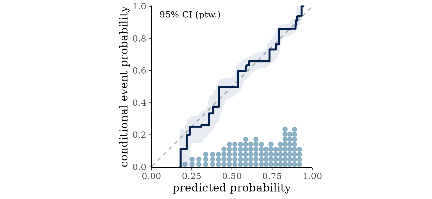
The line should follow the diagonal, and here it does across the whole range. Each patient is judged against a probability estimated without them, so this is not the optimistic in-sample reading.
The default pp_check() compares the distribution of
simulated outcomes with the observed distribution, which is the check to
reach for when the outcome is continuous; with two values to get right
it finds nothing here. vignette("diagnostics") covers what
a departure from the diagonal looks like and what else to check.
Which predictors the model uses
variable_importance(fit)
#> Variable importance
#>
#>  variable prop_used prop_splits splits
#>    surv2m     1.000       0.265   20.2
#>       age     1.000       0.196   15.0
#>     paco2     0.971       0.113    8.6
#>      pafi     0.928       0.070    5.4
#>       rhc     0.905       0.076    5.7
#>       aps     0.871       0.069    5.3
#>       edu     0.657       0.042    3.2
#>      crea     0.577       0.030    2.3
#>      card     0.524       0.024    1.8
#>      hema     0.505       0.026    2.0
#>    meanbp     0.490       0.020    1.5
#>      race     0.462       0.021    1.5
#>      resp     0.453       0.027    2.0
#>       sex     0.410       0.020    1.5
#>
#> ℹ splits_lower and splits_upper hold the 95% interval, not shown above.
splits is the average number of splitting rules the
forest spends on each predictor per draw, and prop_used is
the proportion of draws in which the predictor received any rule at
all.
surv2m takes the most rules, which is unsurprising: it
is a prognostic score built to predict survival. Age follows. At the
bottom, race and sex are used in about half the draws, which says the
model can often do without them.
Two cautions. Usage is not effect size: a predictor can be split on
constantly and still move the prediction very little, and
estimate_effect() in the next section is the better guide
to that. And, when predictors are correlated, the usage distributes
among them more or less arbitrarily.
vignette("importance") covers variable importance and
selection, including how to tell whether a difference in this table
means anything.
Interpreting the fit
A forest has no coefficients, so there is no table of slopes to read.
The question “what is the effect of catheterization” is answered by
asking the fitted model what it predicts when every patient receives it,
asking again when none does, and taking the difference.
estimate_effect() does this, and needs only to be told
which predictor is the treatment:
eff <- estimate_effect(fit, treat = "rhc")

eff
#> Average treatment effect (difference)
#>
#> Treatment: "rhc"
#> Averaged over 1500 units
#>
#>     contrast estimate lower upper    n
#>  Y[1] - Y[0]   0.0568     0 0.111 1500
#>
#> Average potential outcomes
#>
#>  quantity estimate lower upper
#>      Y[0]    0.633 0.601 0.666
#>      Y[1]    0.690 0.646 0.729
#>
#> ℹ estimate is the posterior mean; lower and upper bound the 95% equal-tailed
#>   credible interval.
#> ℹ Y[a] is the average response with "rhc" set to a.
Catheterization is associated with an increase of about six percentage points in the probability of death. The interval runs from roughly zero to eleven points, so the direction is reasonably clear and the size is not.
The lower bound is exactly zero rather than merely close to it, and
that is worth knowing about. The default splitting prior can drop a
predictor from the forest entirely, and in a draw where it drops
rhc the contrast is exactly zero, so the posterior has a
point mass there. The default settings are not necessarily the best ones
to use for causal effect estimation; more specialized methods, like
Bayesian causal forests (BCF) and BART without sparsity-inducing priors,
are described at vignette("causal").
Because the outcome is binary, this is a difference in probability, which is interpretable without reference to the model. That is usually the number to report.
The two probabilities it is a difference of are printed below it, since the difference was computed from them: about 63% of patients would be expected to die without catheterization and 69% with it, averaging over the covariates as they actually occur in this sample.
Looking at a relationship
Effects averaged over the sample hide the shape of the relationship. To see the shape, plot the model’s predictions against one predictor.
plot(fit, ~ surv2m) +
  ggplot2::labs(x = "estimated probability of surviving two months",
                y = "fitted probability of death")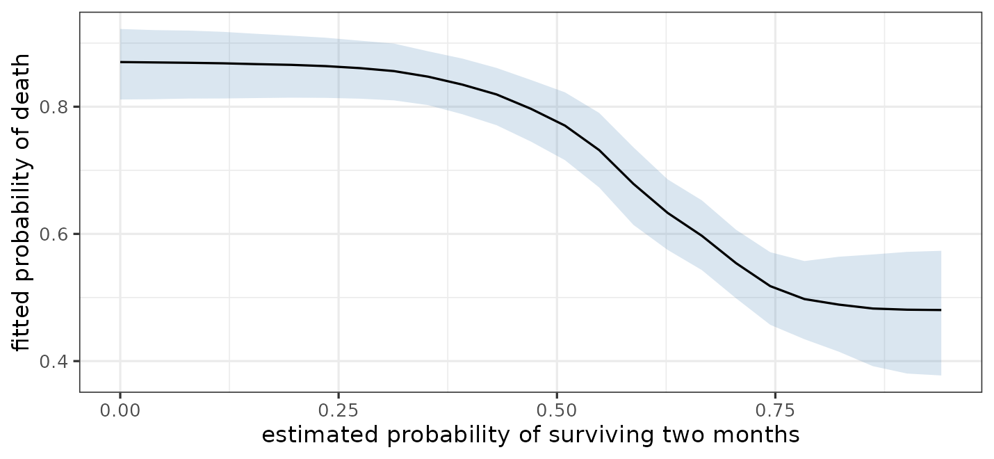
The fitted probability of death falls from about 0.88 to about 0.45 as the prognostic score rises, and the fall is not a straight line. A logistic regression reports one slope on the log-odds scale for the whole range. Nothing had to be specified to find the shape.
The band is a credible interval on the average prediction at
each value, not on any one patient’s, and it widens at the top where few
patients were that healthy. partial_dependence() returns
the same numbers without drawing them, and
marginaleffects::plot_predictions() is the one to reach for
when the grid or what is conditioned on needs more control.
vignette("effects") covers effects, curves, and
interactions.
Predicting new observations
predict() returns the posterior mean prediction.
new_patient <- rhc[1, ]
new_patient$rhc <- 1

predict(fit, newdata = new_patient)
#> [1] 0.8346
For a prediction with an interval, use
marginaleffects::predictions()1:
marginaleffects::predictions(fit, newdata = new_patient)
#>
#>  Estimate 2.5 % 97.5 %
#>     0.839 0.739  0.908
#>
#> Type: response
This describes the probability that a patient with these characteristics dies. It is an interval for that probability, not a statement about which way any individual patient will go: the outcome itself is either 0 or 1, and a probability of 0.7 is entirely compatible with survival.
Comparing models
Approximate leave-one-out cross-validation estimates how well a model predicts data it has not seen.
library(loo)

loo(fit)
#>
#> Computed from 3200 by 1500 log-likelihood matrix.
#>
#>          Estimate   SE
#> elpd_loo   -848.6 17.4
#> p_loo        33.1  1.0
#> looic      1697.3 34.8
#> ------
#> MCSE of elpd_loo is 0.5.
#> MCSE and ESS estimates assume MCMC draws (r_eff in [0.0, 0.2]).
#>
#> All Pareto k estimates are good (k < 0.7).
#> See help('pareto-k-diagnostic') for details.
elpd_loo is the estimated log predictive density on
held-out data, where higher is better. p_loo is the
effective number of parameters, which is a measure of how much of the
data the forest is actually using. The Pareto k diagnostics are all
good, meaning the approximation is trustworthy for this fit.
Two models can be compared directly. Here we ask whether the physiological measurements earn their keep over knowing the patient’s demographics alone:
set.seed(2026)
demographics <- bartisan(death ~ rhc + age + sex + race + edu, data = rhc,
                         family = binomial(), chains = 4)

loo_compare(list(full = loo(fit),
                 demographics = loo(demographics)))
#>         model elpd_diff se_diff p_worse diag_diff diag_elpd
#>          full       0.0     0.0      NA
#>  demographics     -68.2    11.2    1.00
The full model predicts better by around six times the standard error of the difference, which is what you would expect: how sick a patient is on arrival is the main thing that predicts whether they die.
vignette("comparison") covers model comparison, and the
cases where leave-one-out fails.
What to be careful about
The model is flexible about the shape of the relationship and nothing else.
It does not make an association causal. Patients were not randomized
to catheterization; sicker patients were more likely to receive it,
which is exactly the kind of confounding that can produce an apparent
harm. Whether the estimate above can be read as the effect of the
procedure depends on whether the covariates account for that selection,
which is a question about the study and not about the fit.
vignette("causal") covers what is required, using this same
data.
It does not extrapolate reliably. Predictions for predictor values outside the range of the training data are shrunk toward the overall mean rather than continuing any trend.
It does not fix a badly chosen family. Getting the outcome distribution wrong matters more than any sampler setting.
Where to go next
| Topic | Vignette |
|---|---|
| How BART works, and the sampler | vignette("implementation") |
| Choosing a family | vignette("families") |
| Convergence and fit | vignette("diagnostics") |
| Variable importance and selection | vignette("importance") |
| Effects, curves, and interactions | vignette("effects") |
| Model comparison | vignette("comparison") |
| Causal inference | vignette("causal") |
| Censored and survival outcomes | vignette("survival") |
| Frequently asked questions | vignette("faq") |
?bartisan-package has a shorter version of the same map,
organized by task.